Additional Support Material and Notes
Adding style (CSS) rules - Inline, Internal, & External
CSS rules can be added to a document in three different ways - inline, internal, and external. While they all follow the same format for defining a CSS rule the application of these three methods has different effects and both positive and negative aspects.
Inline - the rule is added directly to a tag using the style attribute.
This makes a page (and as a result a site) more difficult to maintain (each page and each individual inline style will need to be changed if we decide to change the look of a page/site) but this method also has the highest specificity and so this rule will apply before all others. This method is useful to use (temporarily) when trying out a style to see if it looks well. This should be avoided in production however.
Internal - the rule is added to a style tag in the head of the document
This method is useful for minor changes to page and for one-off changes. It is also useful for quickly checking if a set of style rules is useful for a page and for testing quickly new ideas. While it causes less problems for maintenance of a site (at least all the style rules are in one place) it still makes a site less easy to maintain and should be avoided for production.
External - the rules are stored in a central CSS file and are linked in each page using a link tag in the head of the document (see the sample videos for example)
This method is the recommended method of adding CSS rules to a site. All the rules are stored in one (or more) centralised CSS files and are linked in each page that wishes to apply them. This means that if we change the rules in the CSS file, then all pages that link to that file will automatically be updated. The con here is that the files can become a bit bloated, particularly if you choose to have just one CSS file for the entire site, which can mean slower load times and pages loading information they may not need. This can be mitigated by having a main CSS file with rules that apply to each page, and then smaller CSS files with rules specific to particular pages.
Tags, IDs and classes
There are a number of ways of selecting elements to apply our CSS rules to (in fact here's a list of the 30 CSS selectors you must memorise - well I say must, more like you should try). In practice though, at least when you're setting out there are only three that you will use most often. These are:
- Tag selectors (which tag on the page are you selecting e.g. body or p or ul etc. - least specific of the three ways - can apply to many elements on the page)
- Class selectors (selecting elements which have the class attribute set to a particular value e.g. <p class="red">....</p> would have a rule of .red - we use the full-stop character to indicate a class in CSS - more specific of the three ways but can still apply to many elements on the page)
- ID selectors (selecting an element which has an ID attribute set to a particular value e.g. <ul id="emails"><li ....></ul> would have a rule of #emails - we use the hash character to indicate an ID in CSS - the most specific of the three ways as IDs are unique and can only apply to one element)
Each is useful in it's own way. Using the tag selector for example I can add padding to all paragraph tags on a page. Using class attribute, I can apply a CSS rule where particular paragraphs have red text. Using the ID selector I can have an individual paragraph have a yellow background. These are just nonsense examples to get the idea across. We'll see more examples in the video and hopefully between this and your own practice you'll understand how it works.
Color - practical and theory
There are three main ways of specifying color (note the spelling - not a mistake - we use american spelling for color in HTML and CSS) in CSS; namely by name, using Hexidecimal values, and using RGB values. I'll deal with these in turn now.
Specifying color by name
There are 140 colors defined by name that all the browsers agree on (you can find the list of them here). The important part here is that they all agree so that when you say you want, for example, the background of your page to be blue that all the browsers will show your page with the same shade of blue. This was a genuine problem in the early days of the web when there was a limited palette of colors available. So navyblue on Internet Explorer would look different to navyblue on Netscape Navigator. While useful for shorthand, I recommend against using names for colors in your CSS.
Specifying color by RGB
This is actually my preferred way of specifying colors but I'm going to explain it next because it will make understanding the Hexidecimal value method easier. When generating colors we mix our three primary colors (Red, Green, and Blue - RGB) in different amounts to get our color. In CSS, each of these (Red, Green, and Blue) can have a value between 0 (so none of that color) to 255 (so all of that color) and by varying the amount of each of these we can generate any other color. To get white we max RGB - so rgb(255, 255, 255) - to get black we minimise all of these - so rgb(0, 0, 0) - and all other colors will be a mix between these two extremes. To make it easier, here's a link to a color picker.
Specifying color by Hexidecimal value
There's a reason I left this one to last. Hex is just the above using a Base16 numbering system. Let's take an example. Supposing I want my text to be green in color. I can specify color: green; or color: rgb(0, 255, 0) or I can specify it as color: #00FF00; To specify a value in hex I use the # symbol followed by 6 characters grouped in twos. The first two is the value of the red color and goes from 00 to FF (that is 0 to 255). The next two specify green, the last two specify blue. To convert a number to hex you just keep dividing by 16. I've a short tutorial here on how it works. Hex is short and quick and useful for quickly picking color palettes that work well together but in practice rgb is much easier to use.
I won't spend too much time here on color theory but here's a link to a site with some very good suggestions. Put basically, you want high contrast between your background color and your text color to make your site easy to read. Try not to have too many jarring colors and stay consistent with your look across your pages - your reader shouldn't think they've accidentally gone to a different site as we move between your pages. In the end though this is an art more than a science and what you think looks good and what I think looks good might be quite different. Try out different things to find your look. For some tips and suggestions on what is popular at the moment check out this site for some ideas.
Fonts and Typography
I won't spend too much time on this for right now - we might come back and expand it in the future. When it comes to fonts, simple is best. Fancy fonts are less likely to be available on your readers machine/device (though we have ways around that) and will make your content harder to read so try and keep it simple. Try also to pick fonts suitable to the medium.
What do I mean by that? Well there are basically two media that your page will be viewed on: screen (desktop, laptop, tablet, or mobile) or print (paper :)). A font that looks well on paper (called a serif font) will be hard to read on screen. And one that's easy to read on screen (called a sans-serif font) will be more difficult to read on paper. Why is this? Screens are made up of lots of tiny boxes called pixels. No matter how fine you make them (how high the resolution of your screen is) they are still boxes and so are great at straight lines but not so good with curves. This means that a sans-serif font (which is straight lined as much as possible) will be really easy to read on a screen. On the other hand, on paper a serif font makes content easier to read. A serif font has lots of curves and little tails that help the eye move from one letter to the next, making it easier to read. Straight lined fonts make content harder to read on paper.
Other things we need to take into consideration include size, spacing, height, weight. We've covered some of these in the videos but for more information on best practice, check out this site for some suggestions.
Another consideration is what fonts are likely to be on the clients machine. Using unusual or funky fonts may mean the site looks great on your machine but what will it look like on the clients? One way around this is to use a list of fonts. Read from left to right, each will be tried to see if it's available and if not the browser moves onto the next. When generating this list we therefore go from unusual fonts first to generic fonts last - e.g. font-family: geneva, trebuchet ms, tahoma, arial, sans-serif; The last choice here is the generic sans-serif class i.e. use whatever sans-serif font is available on the machine. This often means however that only the generic fonts will be used and so your site won't look exactly as you had planned. Another way around this is to use web-fonts.
Web-fonts allow for fonts to be downloaded and used as needed when the page loads - just as we specify images we want to use. There are two main ways of importing fonts in this way - using the @font-face rule or using the @import rule. The first requires access to the web-font file (generally in .woff format). The second requires access to a stylesheet which contains all the information for the font. In this course we've used the @import rule and free fonts from https://fonts.google.com/. Check out this site for other cool and funky fonts you can use (and yes I know I've used the word funky waaaaayyyy too much in this section - I'll tone it back :) )
Units
I couldn't possibly explain this better than w3schools (here's the link to their page on units) but basically many attributes take a size value e,g, width, height, margin, border etc. In order to use the value you supply you need to tell the browser what unit you're using to measure the value e.g. pixels, centimeters, point etc. Some of the units are fixed and so cannot adapt to different screen resolutions (again the problem of not knowing where and how our page will be viewed by the client) and so for clients with screens much bigger (or much smaller) than the one we develop on the site will not look as well. Other units are relative and so can adapt - but again this unsupervised adapting may lead to outputs not as we intended. Some of these issues we will deal with when we get to using a framework like Bootstrap but some we can deal with ourselves using @media queries. For now though, the most commonly used units will be px (pixels - fixed unit), % (percentage - relative unit), em and rem (relative units). For more information on units check out w3schools page on CSS units.
Specificity
Sometimes, we have a situation where an element has a set of competing rules being applied to it. Let's take as an example a div with id of third_div (it's the third division div) and a class of red (all text will be red). Suppose our CSS has the following rules:
body { color: green; }
div { color: blue; }
.red { color: red; }
#third_div { color: yellow; }
What color will the text in the div#third_div be? All four rules above apply to it - it's in body so it should be green, but it's a div so it should be blue, but it's got a class of red so it should be red, but it's got an id of third_div so it should be yellow. What color will it be?
The answer is yellow and the reason is down to specificity - that is the rule most specific to an element is the one that's applied. The specificity goes from global (* - lowest) to parent element to element to class to id (highest). For a list of the specificity rules check out cssspecificity.com for a nice infographic and https://specificity.keegan.st/ for a calculator. This is one of the things that can make CSS frustrating so check it out when you get a chance.
The Box Model
The box model defines how much space an element takes up and what spacing is around it. For block level elements (paragraphs, divisions, tables, lists etc) there are four main spaces that the element has. These are:
- Content box: The area where your content is displayed, which can be sized using properties like width and height.
- Padding box: The padding sits around the content as white space; its size can be controlled using padding and related properties.
- Border box: The border box wraps the content and any padding. Its size and style can be controlled using border and related properties.
- Margin box: The margin is the outermost layer, wrapping the content, padding and border as whitespace between this box and other elements. Its size can be controlled using margin and related properties.
Diagram of the box model
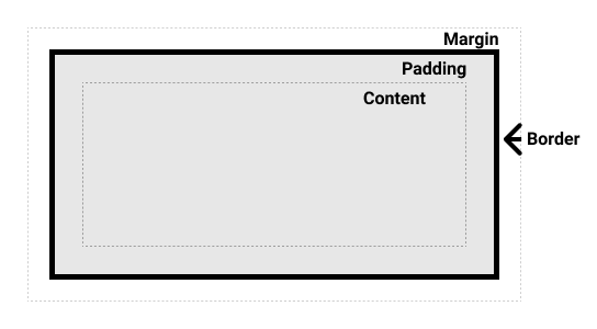 (Explanation and diagram courtesy of https://developer.mozilla.org/en-US/docs/Learn/CSS/Building_blocks/The_box_model)
This model is mainly of importance when you have a layout of fixed size (e.g. if your content will have a particular width and all sub-content must fit inside this width) and is useful when trying to get block level elements to sit side by side. There are also some (now quite minor) differences in how the different browsers implement the box model going back to the browser wars of the mid and late nineties. We'll look at some of these concepts in our videos above.
@media queries - how to control the unknown
One of the more challenging aspects of web design is the lack of control over where and how our content is viewed. The design we toiled over looks great on our screen but how does it look on a much larger screen, a much smaller screen, on a laptop, on a tablet, on a mobile device? In the earlier days of web design we tried (often poorly) to tackle this using javascript, checking the screen resolution and adapting our css based on it. It rarely worked well. Now, since CSS2, we can use @media queries to have specific rules that only apply under particular circumstances. So if we're viewing on a device we show one set of rules, if it's print a different set again. If the screen is wider than 1280px one set of rules, if it's smaller than 640px a different set again. This gives us much more control over the appearance of our site and hopefully a better experience for your user. The general format for the @media query is as follows:
@media not|only mediatype and (expressions) {
//css code goes here
}
- @media is required and shows this is a media query.
- not|only are optional and can be used to make rules only apply to, for example, print or screen or mobile.
- mediatype indicates what we're viewing the site on and can be either all (applies to any media), screen, print, or speech.
- expressions allow us to specify, for example media with a min-width or max-width and so in effect what devices we're viewing on (for suggested min-widths and max-widths for various devices please check out this site)
The recommended way to use these is to have your CSS file have all your general rules followed by @media queries for the changes needed for various devices or screen widths or print. For more information check out CSS Media Queries (w3schools.com)